

Watch This Ready is a story-driven production company started by Michael Covino, Kyle Marvin and Emily Koretweg. They wanted a look that combined a vintage aesthetic but also hinted at a rich knowledge of graphic design and filmmaking/video history.
During this process, the team created a robust visual identity that included a logo, stationary, collateral and animation.
CLIENT: watch this ready
ROLE: creative director + designer
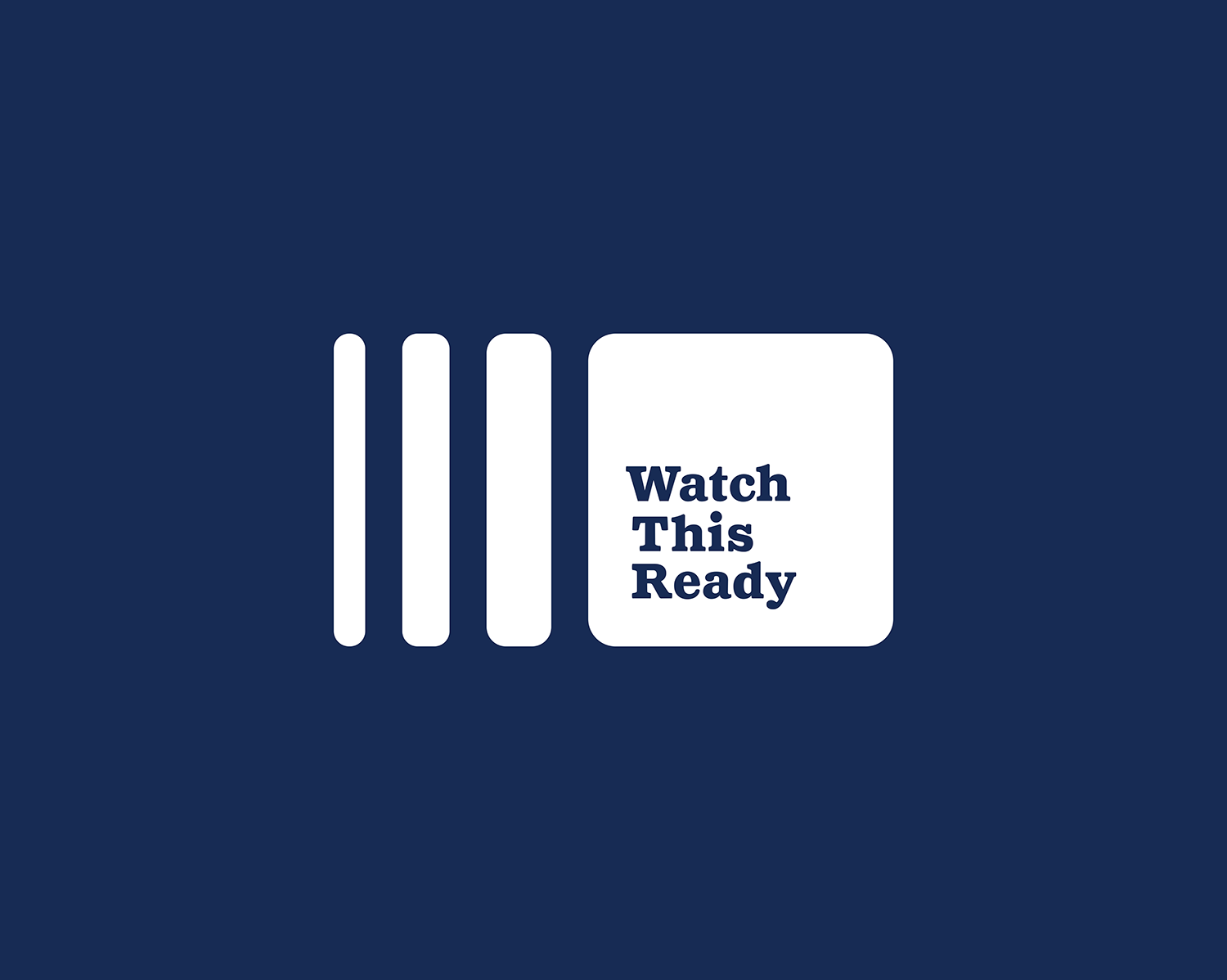
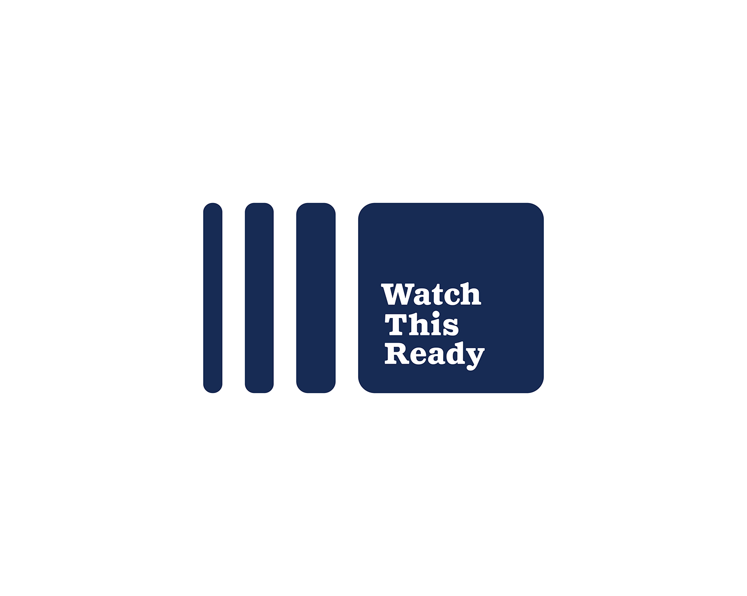
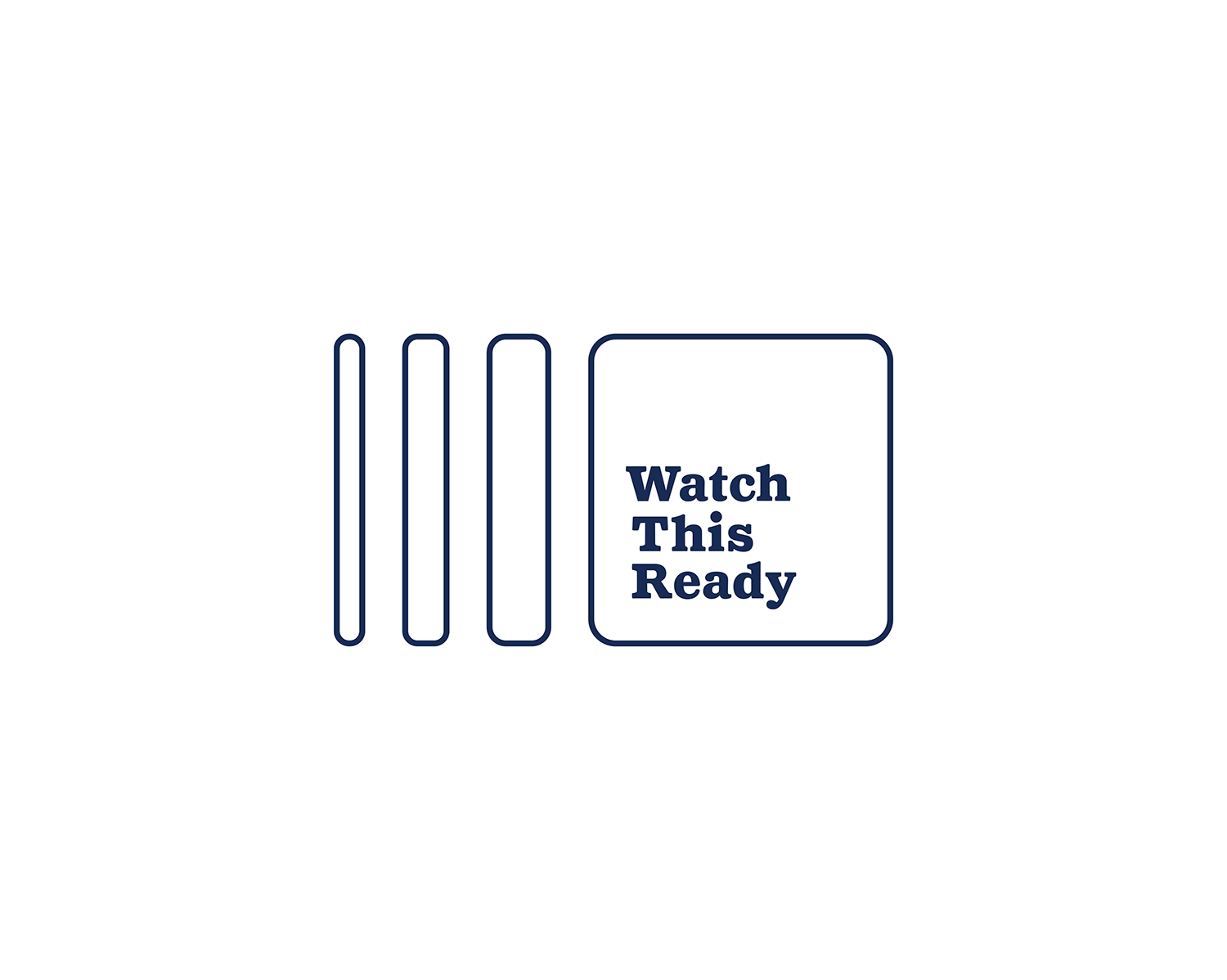
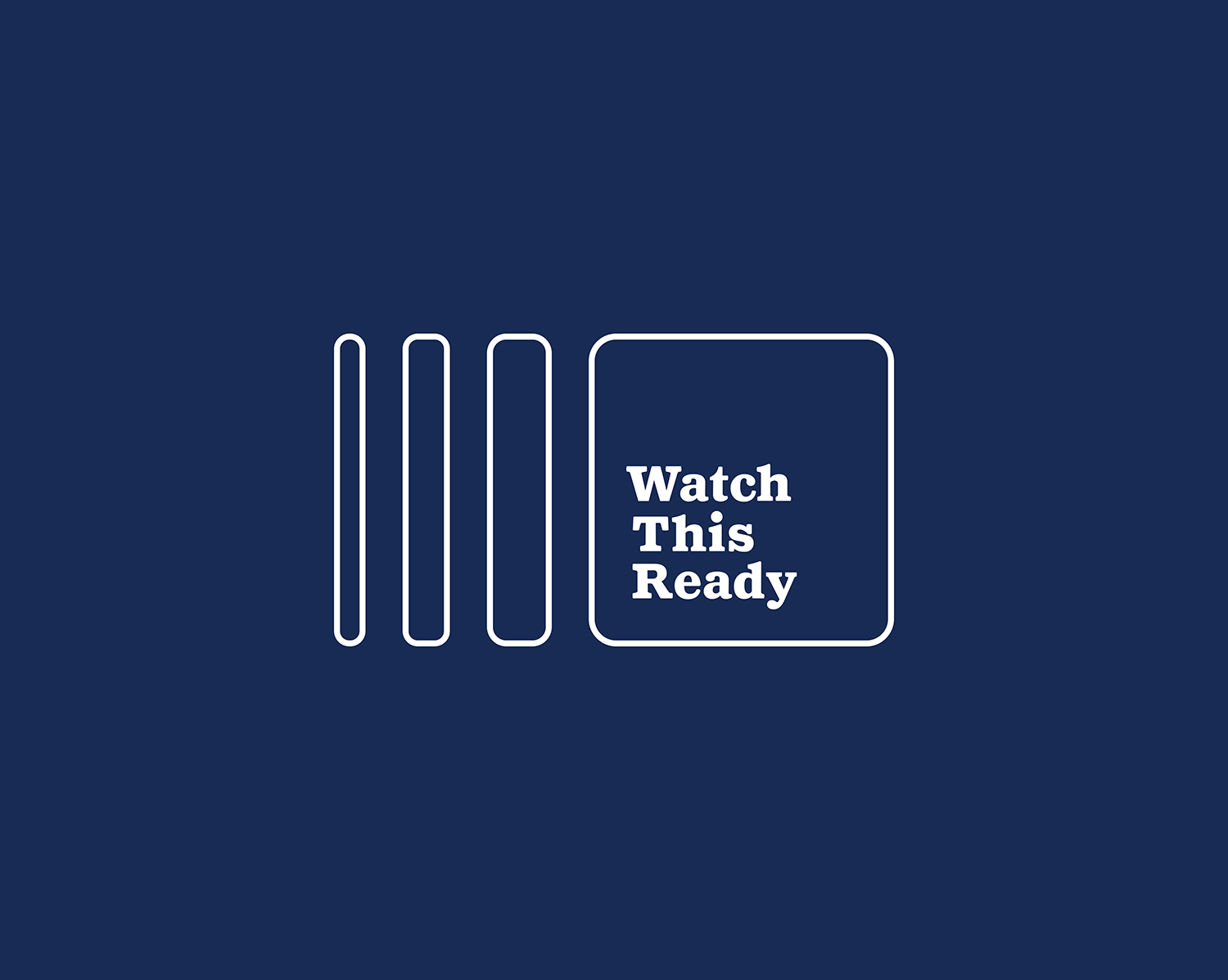
The logo consists of three icons locked up with a simple custom logotype. The icons represent the motion of a vintage View Master; the first-hand experience of clicking the shutter and having a new image appear.
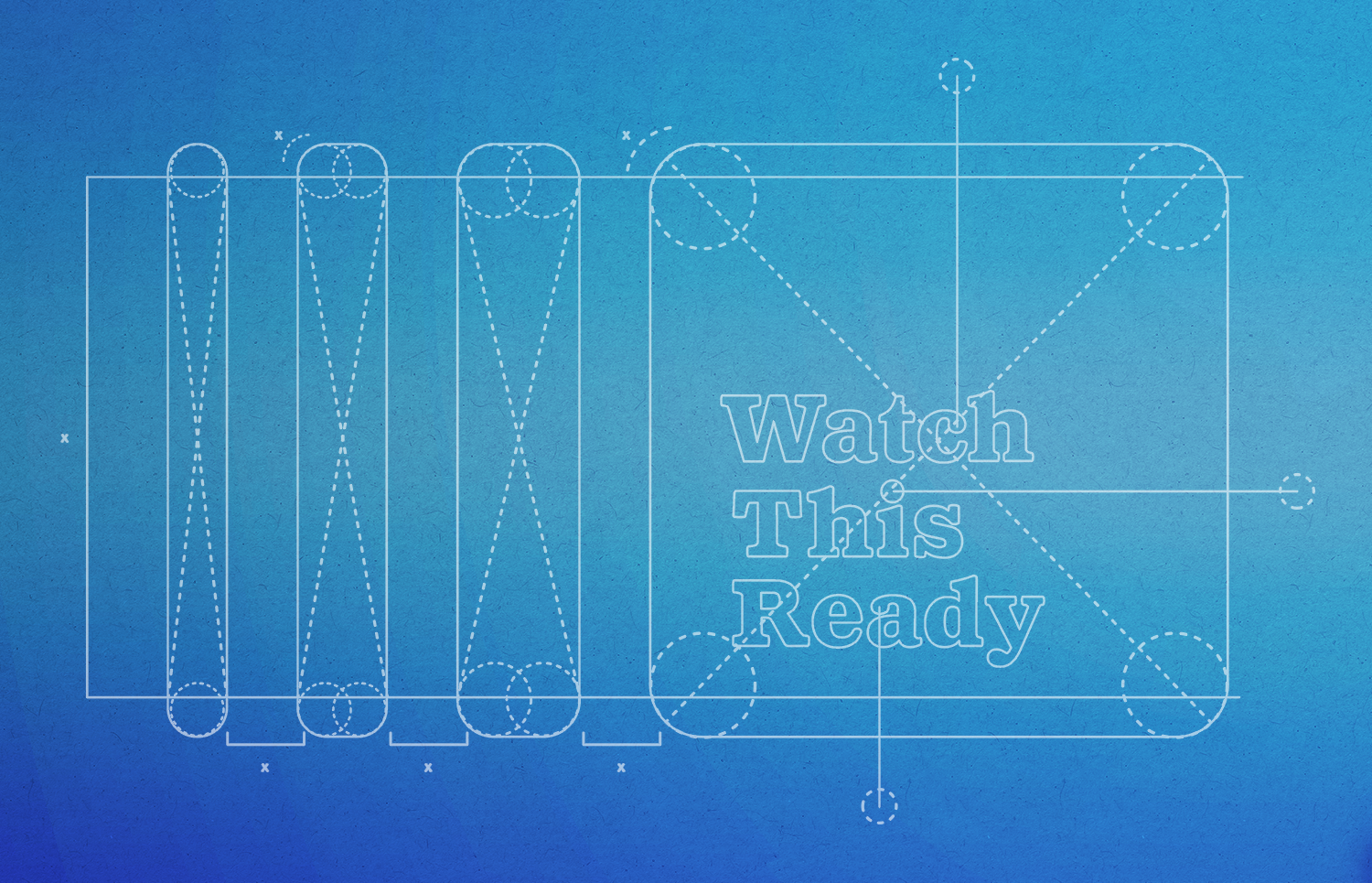

The animation above highlights the color story, copy samples and chosen typefaces. This includes Antique Black No.2, a boutique re-cut type by Jesse Vega.
Collateral

Various Pieces of Stationary
The team needed stationary and promotional items to fully realize the business. We opted for clean and simple design that highlighted the logo.
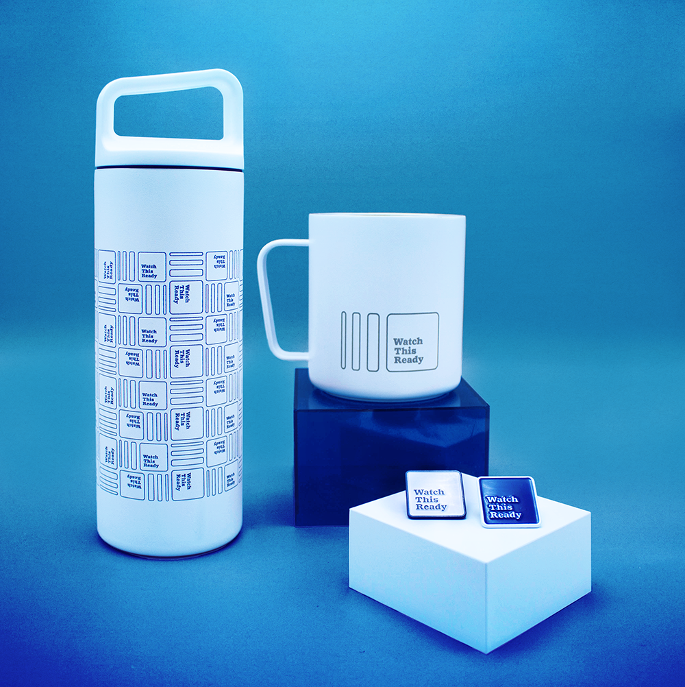
Water Bottle, Coffee Mug and Pins
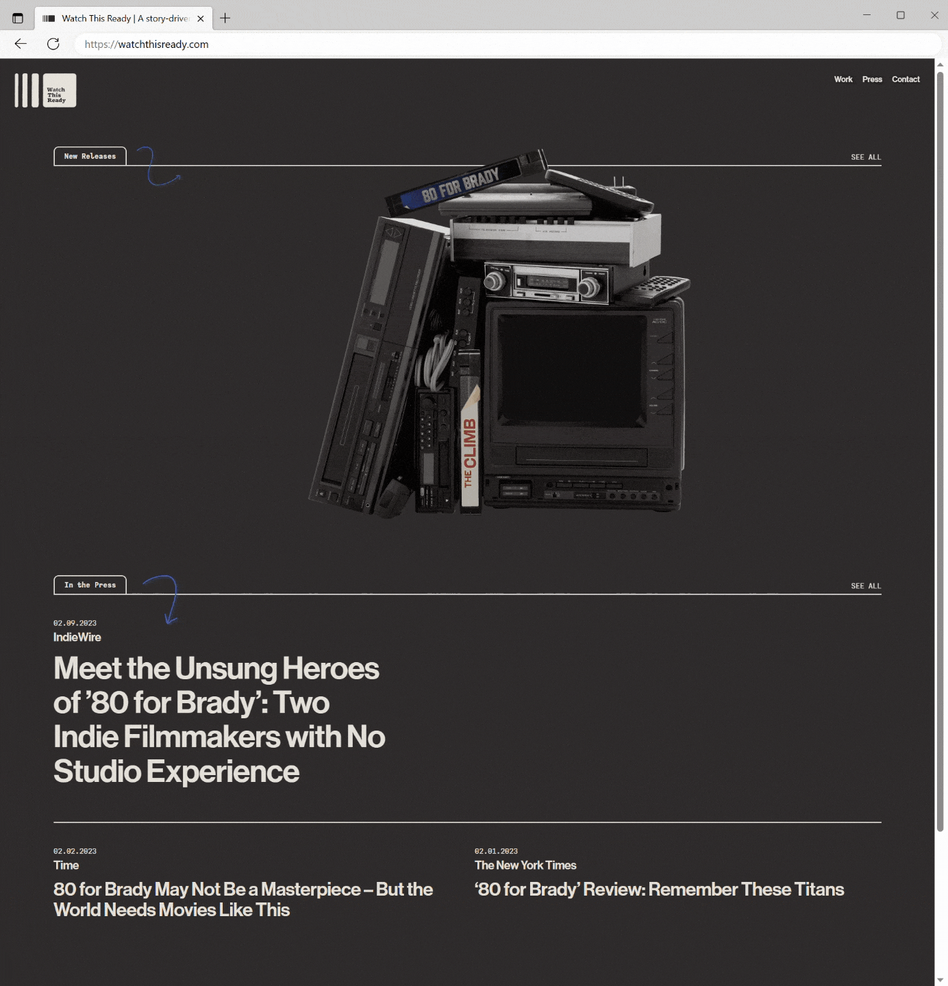
For the website, designed by Maddie Black, WTR utilized our design ideas to complete the look.
Motion
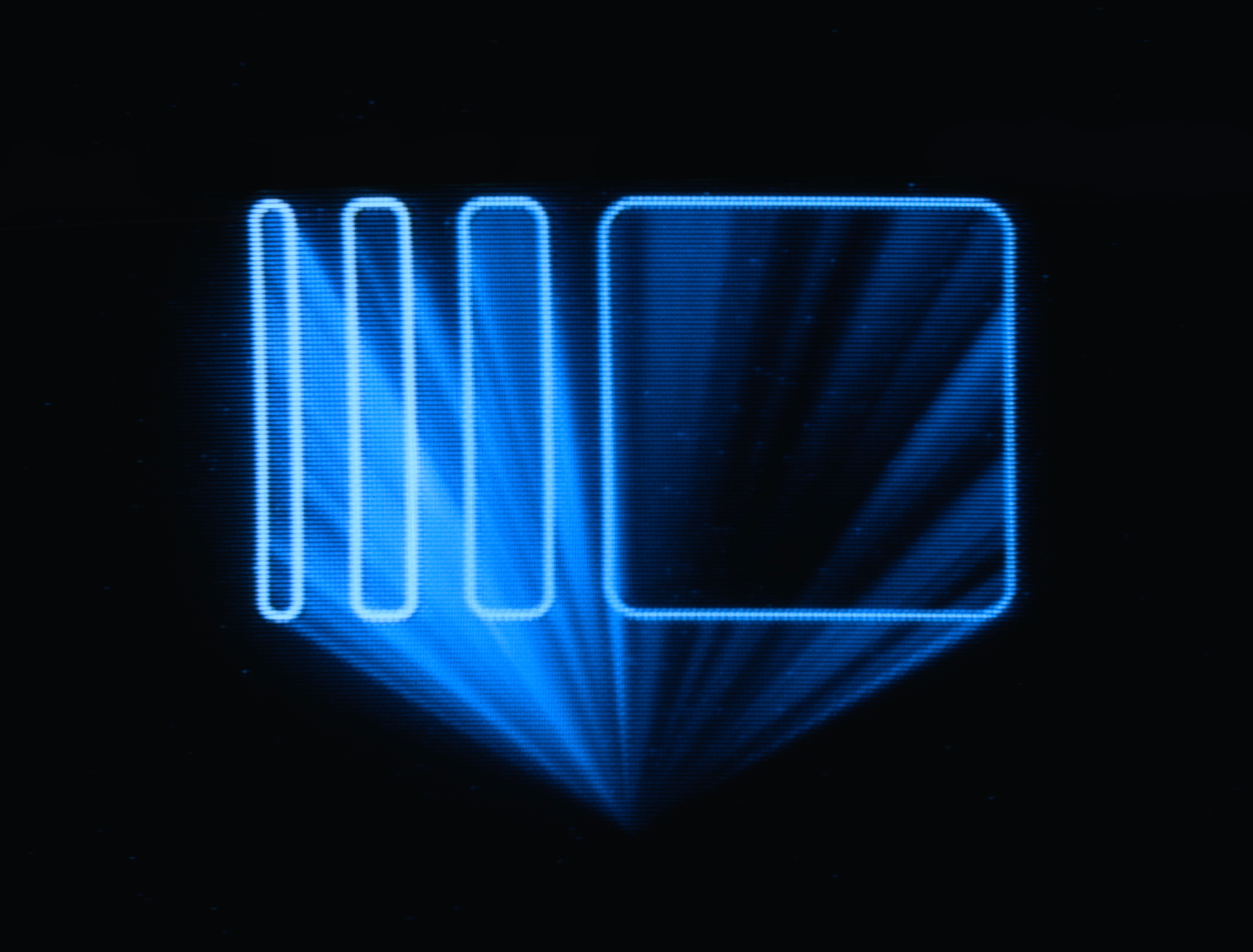
Upon applying motion, the team decided to first design the logo in the spirit of Scanimate-style video bumpers. After animating, the logos were rerouted onto a television where the analog signal could be altered (as there was no access to an actual Scanimate) thus giving a vintage VHS look. Then that was filmed on camera to combine the analog and digital style. Watch This Ready’s logo variations. The logos are chosen based on director’s preference on every project.

Creation of altered logos below:

A variation of the logo in original form.

The logo being degraded via a television.

Credits_
Creative Direction + Motion Design // Emily Suber
Typeface Design // Jesse Vega
Web Design // Maddie Black
Additional Graphic Design // Jon Schaefer
Producer // Emily Korteweg