

Moon Mannequin is a Chicago-based band with a dreamy sound. For their debut album, they wanted art that paid homage to both the natural world and the Wiener Werkstätte movement. Upon researching this group and learning how it was inspired from the Arts & Crafts movement, it made sense to also reference the work of architect Frank Lloyd Wright (particularly due to the Chicago connection) and the Glasgow Style. Combining elements of machinal geometry and the natural world was the team able to come up with this inspired art.
CLIENT: Moon mannequin
ROLE: design + illustration


Moon Mannequin The Way Is Wide album art from top: Cover, Back, Label Sticker and Gatefold.

Typography
For the typography, we combined the forces of two typefaces. For the logo we used P22 Eaglefeather by P22 Foundry since it is based on the alphabet designed by Frank Lloyd Wright for the Eaglerock project in 1922. All other copy was set in Goudy Old Style by Frederic W. Goudy. Goudy was created in the early twentieth century and was also inspired by the same movement.
research
Upon research of the decorative arts movements of the late 20th and early 21st century, it led to a plethora of inspiration ranging from the Arts & Crafts movement, Wiener Werkstätte and the Glasgow Style. We tried to pay ode to printmaking, the natural world and decorative arts in equal measure.

Clockwise from left: Wiener Werkstätte postcard by Ludwig Jungnicke and letterhead by Koloman Moser, Frank Lloyd Wright’s Robie House and art deco flower design, Glasgow Style book cover by Talwin Morris
production

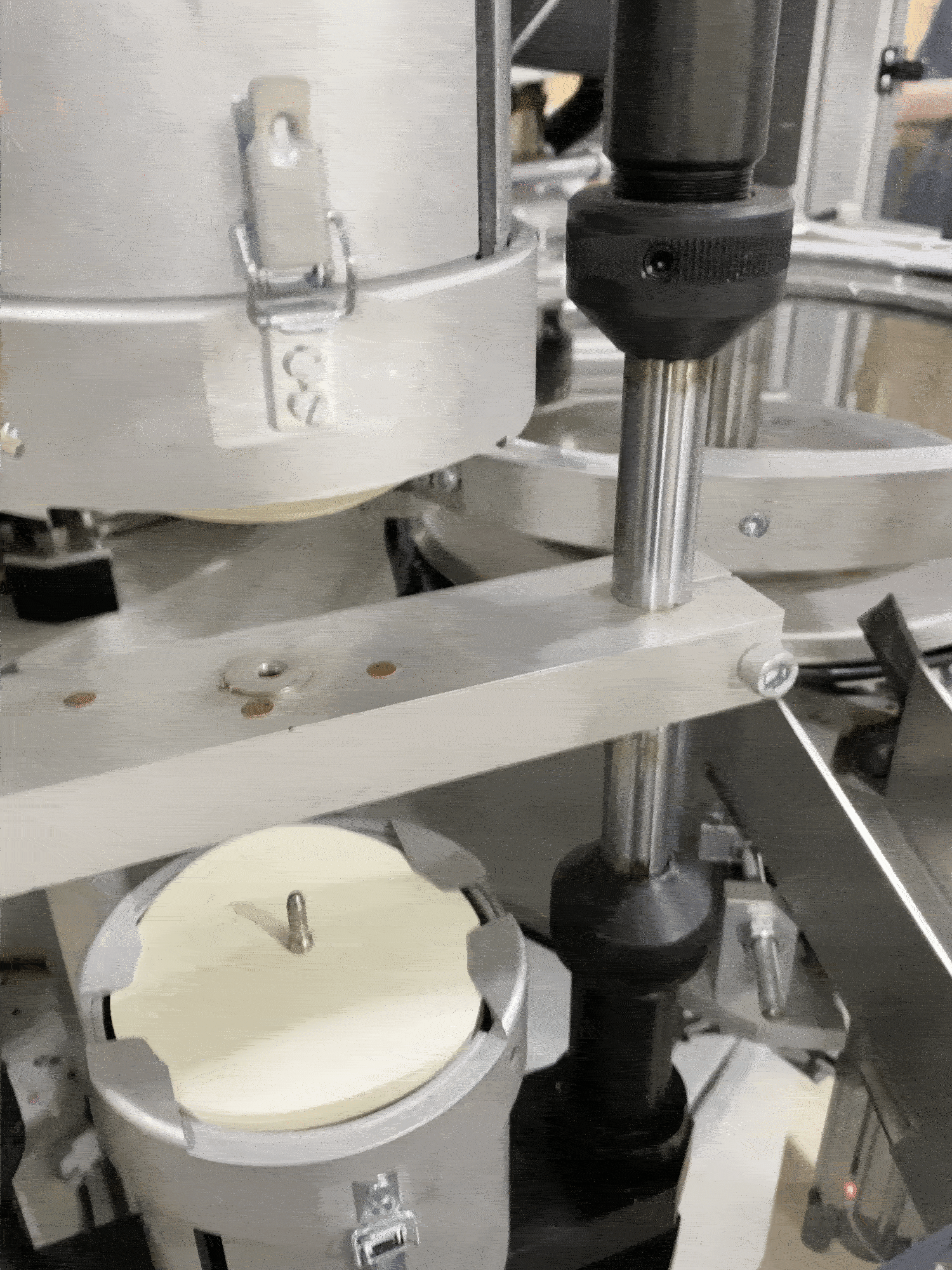
Two quick videos of the label printing process courtesy of Gold Rush Records.
Credits_
Design + Illustration // Emily Suber
Typeface // P22 Eaglefeather by P22 Type Foundry (David Siegel + Frank Lloyd Wright) and Goudy Old Style by Frederic W. Goudy
Printer // Gold Rush Vinyl