
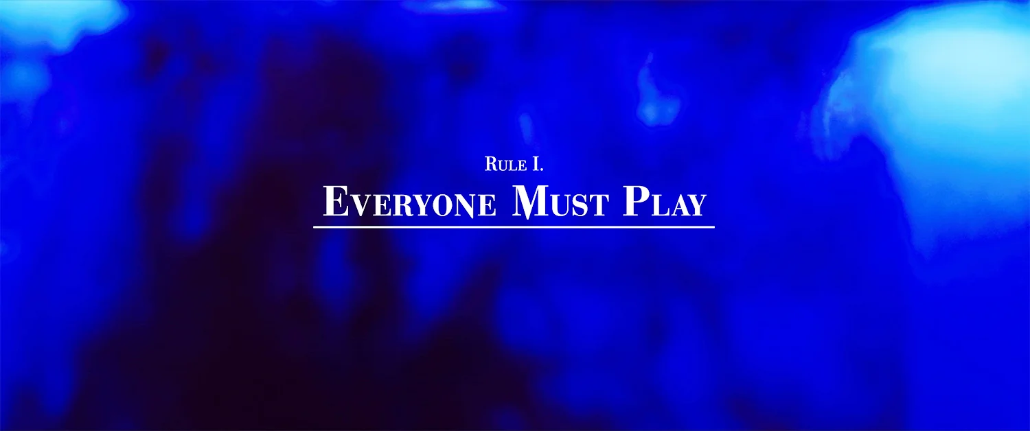
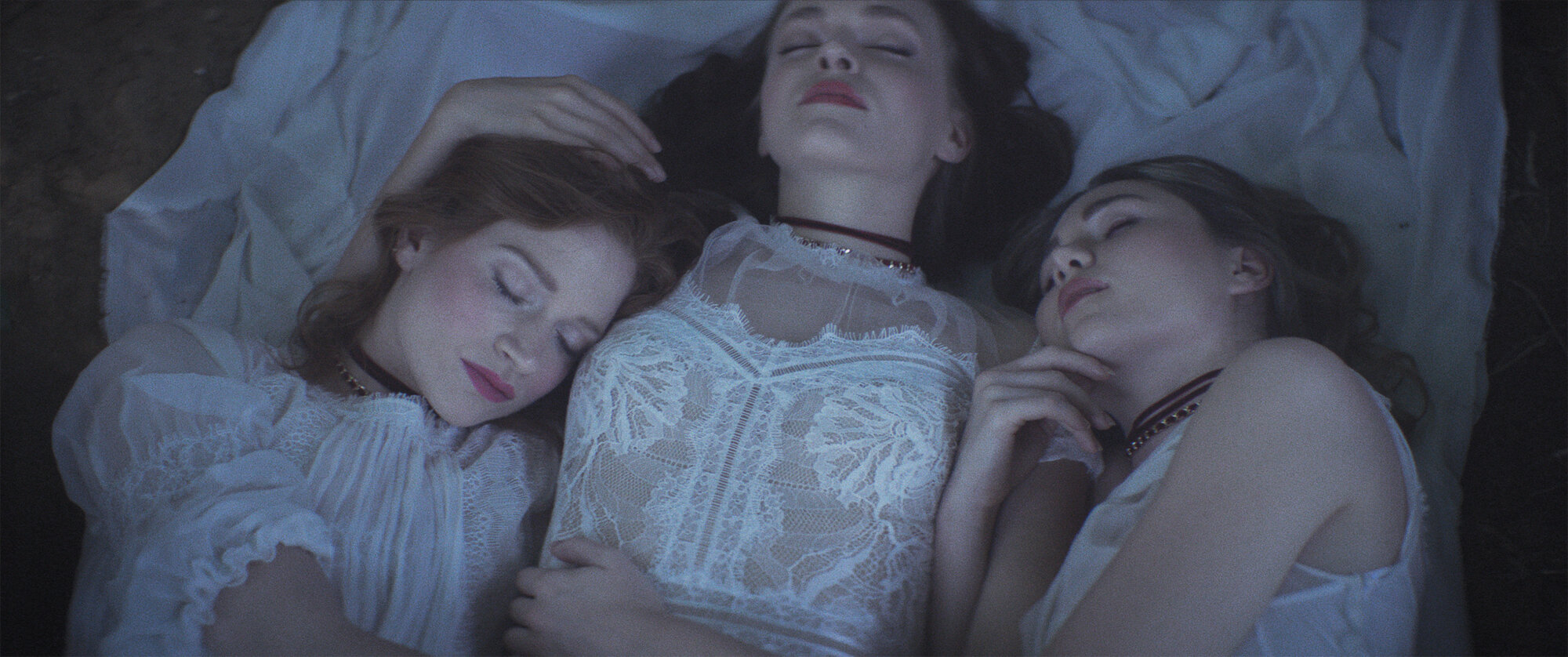
A crazy romp within the fantasyland world of three friends, the feature film Braid’s title treatment was the beginning glimpse into their story. Combining slasher film energy into art house elegance, a sequence was created using a hand drawn typeface, ink splatter and utter chaos. Shown are the opening title treatment and a chapter title example.
DIRECTED BY Steven soderberg / USA
distribution: netflix
ROLE: TITLE / MAIN-ON-end DESIGNER


The inspiration for Braid’s title sequence stemmed from maniacal nature of the story. Director Mitzi Peirone was drawn to the look of Rorschach Tests, aka ink blot tests which melded well with the psychological undercurrents. We took the symmetry of an ink blot test (essentially 2-D) and made it into a practical three-dimensional effect.

Title Card

Original typeface by Mitzi Peirone

Director Card

Director Mitzi Peirone had also been taken with creating her own typography (shown above). I was able to take her sketches, edit them in illustrator and output them as a font. Unfortunately, this only worked for the title sequence as its more of a display typeface (as opposed to text.) My solution was to take another typeface Bodoni (which also has contrasting strokes like the director’s original font) and alter it to create some devilish looking accents.


production
Direction // Steven Soderbergh
Producer // Joe Malloch
Cinematography // Steven Soderbergh (as Peter Andrews)
Executive Producer // André Holland, Ken Meyer
Starring // André Holland, Zazie Beetz, Melvin Gregg, Zachary Quinto
POst
Editing // Steven Soderbergh (as Mary Ann Bernard)
Music // David Wilder Savage
Sound Design // Harbor Picture Company
Color // Nat Jencks
Title Design // Emily Suber
Distribution // Netflix